School website service training and support

Hero banner

Use this guide to add or edit the hero banner component.

The hero banner component provides a variety of layouts that you can use in the banner area of your website with various styles of image, carousel slides, videos and link options.

Before you start

Navigate to the home page where you want to add or edit the component and you are ready to begin.

To login and start editing, please follow these instructions.

Note: This component is only available on the home page and specifically in the banner area of the homepage.

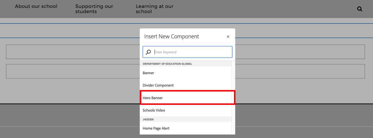
  • Select Hero Banner from the Insert New Component list.

Available layouts and rules

The hero banner has numerous layouts available. There are some rules in respect to combinations that you can use.

Image banners

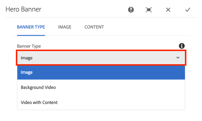
  • Static image: The static image shows a single image. You can add heading, description and call to action button. The static image can be used with the button or tiles content options.
  • Image carousel: The image carousel shows multiple slides. You can customise the heading, description and call to action link for each slide. The carousel can be used with the buttons content option, but not with tiles.

Image sizes: Images should be in standard 3:2 aspect ratio (landscape) and ideally 1600x1066 size. Learn more about image sizes.

Background video

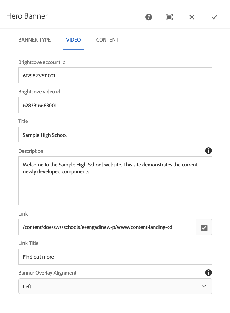
  • The background video selector has a background video embedded from Brightcove. You can have a heading, description and call to action button. This layout can be used with the buttons content option.

Video with content

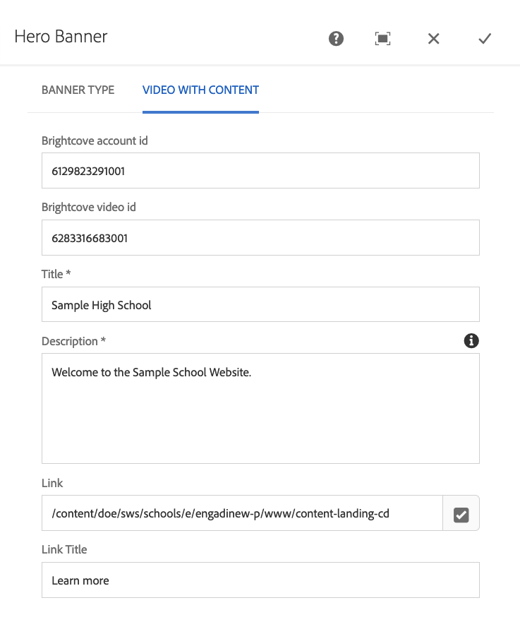
  • Video with content selector shows a video with a content box. The video is embedded from Brightcove. This layout has no further content options.

Content options tab

  • Buttons: You can include up to four buttons which will sit below your static image, carousel or video background hero banner.
  • Tiles: You can include up to four content tiles that will sit above the base of your static image banner.

Configuring the layouts

  • Click on the newly added Hero Banner component (or an existing one)
  • Now choose the Spanner icon
  • The configuration options appear

  • In the Banner Type tab you can choose the type of hero banner you wish to use. The different banner types are detailed above
  • Depending on the type of banner you choose, different options are available to configure 

Banner types

The following banner layouts are available to use. They have different content options.

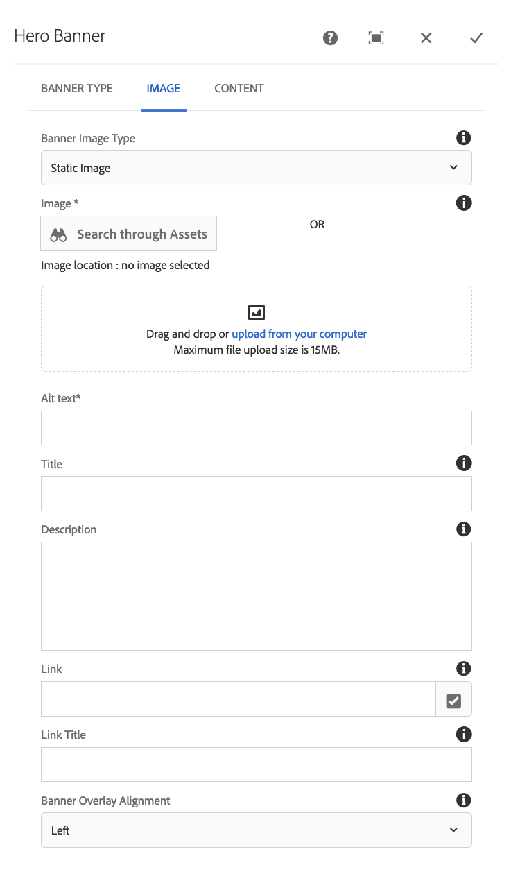
  • Search through assets: If you have uploaded your image already to assets you can click on the Search through Assets button to find it
  • Drag and drop or upload from your computer: You can use this option to either upload an image by drag and drop from your computer or by clicking the upload from your computer to browse through files on your local computer. The maximum size is 15mb.
  • Alt text: This is the alternate text used by screen readers. This is important for accessibility
  • Title: This is the title used for the overlay box on the banner. This is not mandatory
  • Description: This is the description text used for the overlay box on the banner. This is not mandatory
  • Link: This is the link for the call to action button in the overlay box on the banner
  • Link title: This is the text that appears on the button
  • Banner overlay alignment: You can choose if the banner overlay box should be left or right aligned.

Content options tab - Static image - button

These are the available options:

  • Button link: This configures the link for the button content. The link can be to a page on your website or to an external link if you use the full https:// link.
  • Button title: This configures the title for the button content
  • Add: This allows you to add more than one button. You can have a maximum of four buttons.
  • Reorder: If you have more that one button configured, you can drag the reorder icon up and down to change the order of your buttons.
  • Trash bin: Clicking the trash-can icon will remove the respective button.

Content options tab - Static image - tiles

These are the available options:

  • Title of the tile: This is the title shown at the top of the tile. This can be up to 30 characters
  • Description: This is the description text shown on the tile. This can be up to 60 characters.
  • Tile link: This configures the link for the tile content. The link can be to a page on your website or to an external link if you use the full https:// link.
  • Link title: This configures the title for the link
  • Add: This allows you to add tiles. You can have a minimum of two tiles and a maximum of four tiles.
  • Reorder: You can drag the reorder icon up and down to change the order of your tiles.
  • Trash bin: Clicking the trash-can icon will remove the respective tile.

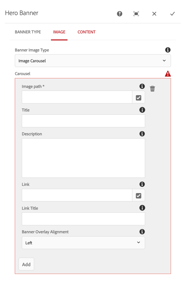
The carousel option lets you configure slides for the carousel. For this layout option you need to upload your images to assets first. Note with the carousel you cannot use the tiles.
  • Add: The first option presented is the add button, use this to add the required number of carousel slides. When you have added slides, this appears beneath the slides.
  • Delete slide: The delete option appears as a trash-bin icon once you have added at least one carousel slide. Once you have deleted a slide, it cannot be recovered.
  • Re-order slide: The reorder slide option appears as an up and down arrow icon when there are at least two carousel slides. Click and drag this icon up and down to re-order slides.
  • Image path: Click on the tick button beside this field to find the image you have uploaded to assets for the slide.
  • Title: This is the title for the carousel slide. You can use up to 30 characters.
  • Description: This is the description text for the carousel slide. You can use up to 140 characters.
  • Link: This is the link for the button used on the carousel slide. This can be a page on your site or an external link.
  • Link title: This is the title of the button link.
  • Banner Overlay Alignment: This controls the alignment of the overlay text box. It can be aligned left or right to better fit each image you are using.

Content options tab - Carousel - button

These are the available options:

  • Button link: This configures the link for the button content. The link can be to a page on your website or to an external link if you use the full https:// link.
  • Button title: This configures the title for the button content
  • Add: This allows you to add more than one button. You can have a maximum of four buttons.
  • Re-order: If you have more that one button configured, you can drag the re-order icon up and down to change the order of your buttons.
  • Trash-can: Clicking the trash-can icon will remove the respective button.

  • Brightcove account ID: The ID of the brightcove video account. You can get this from Brightcove when you have logged in.
  • Brightcove video ID: The ID of the brightcove video. You can get this from Brightcove video information.
  • Title: The title of the text overlay.
  • Description: The description text for the overlay box, this can take up to 140 characters.
  • Link: The link for the button on the overlay box.
  • Link title: The title for the button.
  • Banner overlay alignment: This can be set to left or right to suit the video you are using.

Content options tab - Background video - button

These are the available options:

  • Button link: This configures the link for the button content. The link can be to a page on your website or to an external link if you use the full https:// link.
  • Button title: This configures the title for the button content
  • Add: This allows you to add more than one button. You can have a maximum of four buttons.
  • Re-order: If you have more that one button configured, you can drag the re-order icon up and down to change the order of your buttons.
  • Trash-can: Clicking the trash-can icon will remove the respective button.

  • Brightcove account ID: The ID of the brightcove video account. You can get this from Brightcove when you have logged in.
  • Brightcove video ID: The ID of the brightcove video. You can get this from Brightcove video information.
  • Title: The title of the text overlay.
  • Description: The description text for the overlay box, this can take up to 140 characters.
  • Link: The link for the button on the overlay box.
  • Link title: The title for the button.

The video with content layout doesn't have any additional content options (eg. buttons or tiles).