Use this guide to add or edit the card component.
The card component provides two styles that you can use to highlight content, and include a link to another page on your website or to an external web page.
Placement on pages
The card component is available for the following page types:
- Home page
- Content landing
- Standard page
- Event landing
- News landing
- News article
- Event
Card styles
The component has two style options:
- Card with image
- Card with no image
Card layout
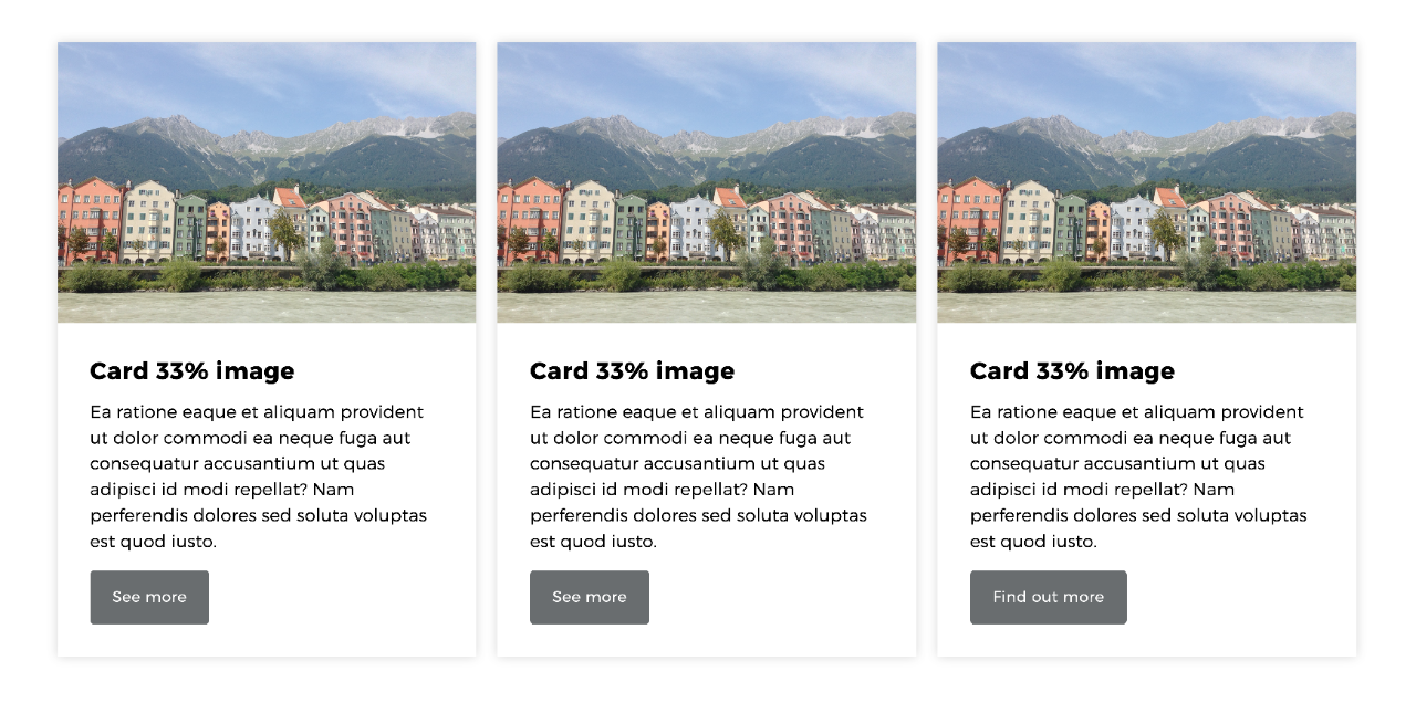
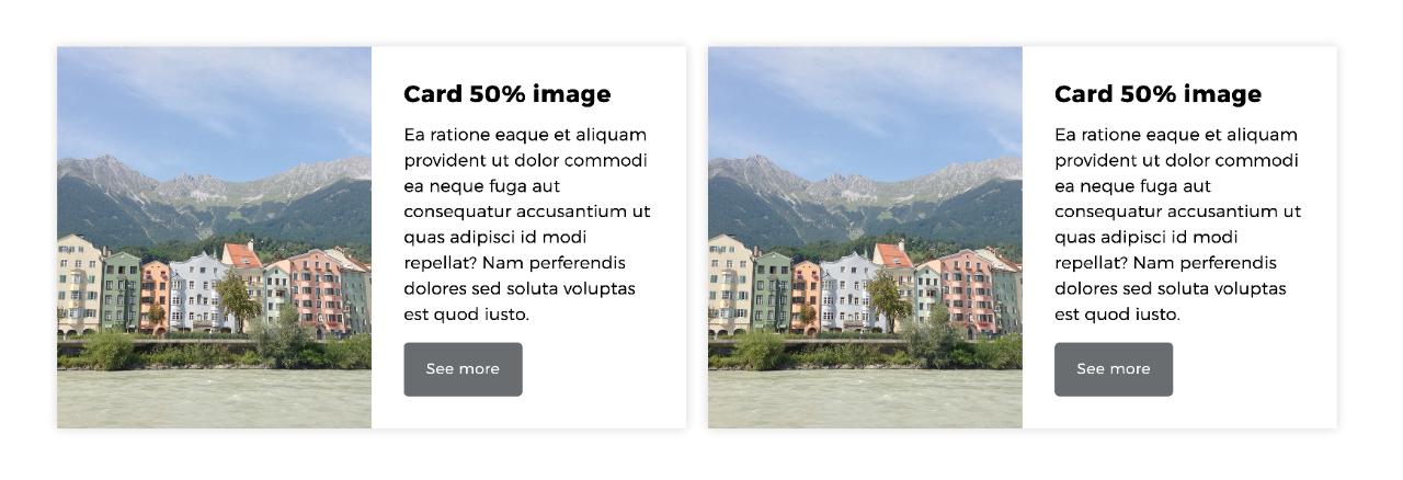
Depending on how the card component is used, you'll see a different layout arrangement.
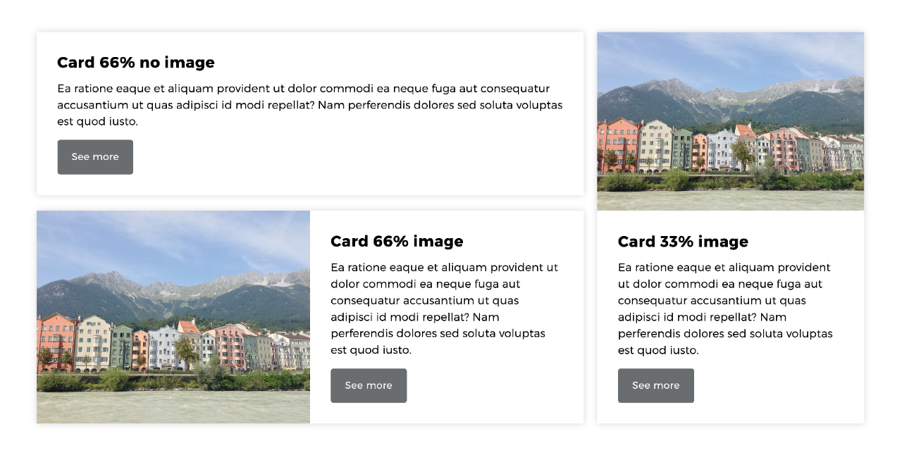
You can also use the card component inside of a column control to arrange the cards.
The card layouts adapt automatically to how and where they are being used, for example:
- 33% column - image will display at the top
- 50% column - image will display on the left
- 66% column - image will display on the left
The automatic layout arrangements will also adapt depending on the browser window size or the device you are using.
Layout combinations
The following images are examples of the various layouts of the card component and ideas on how to use them on your pages.
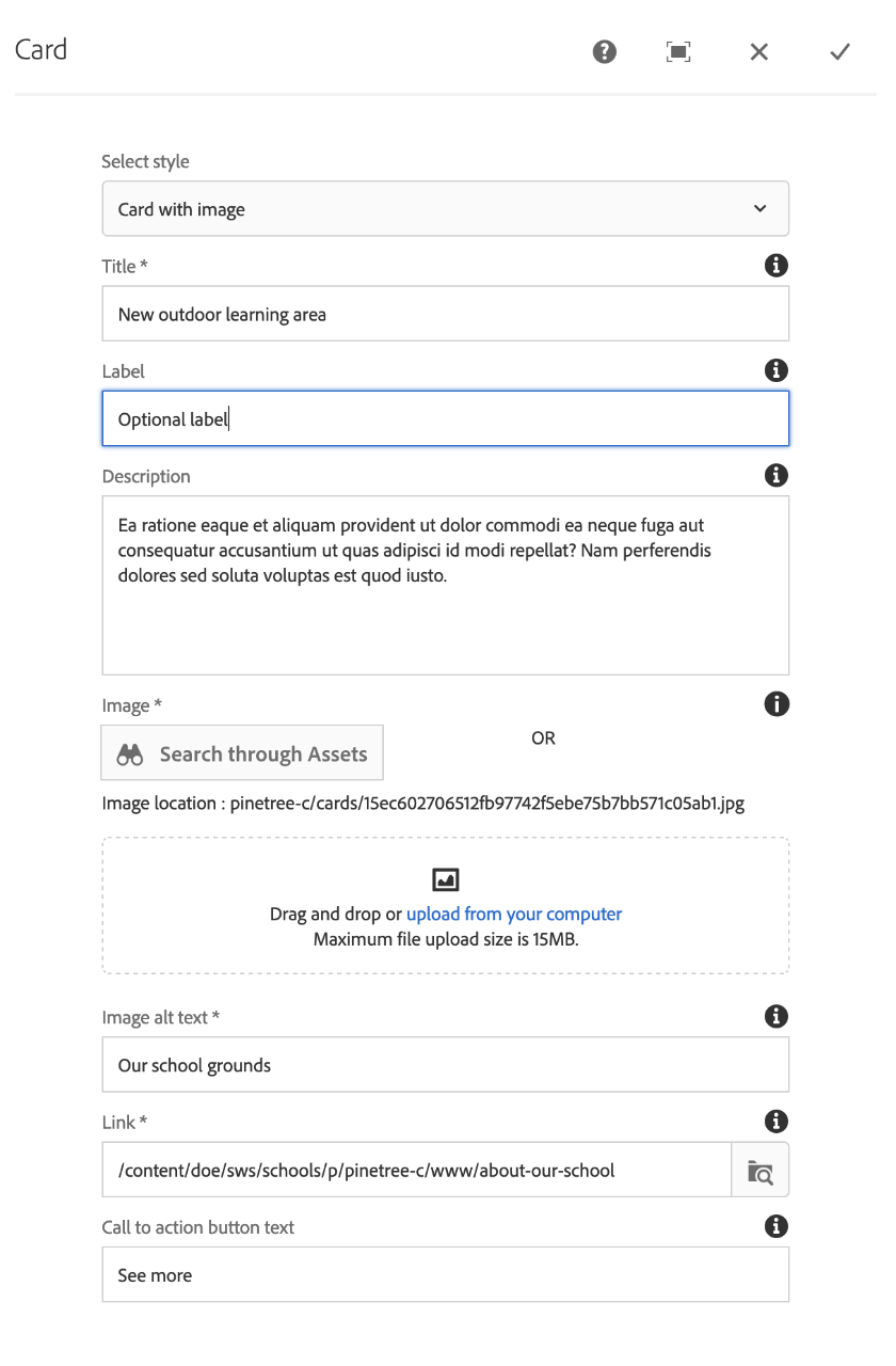
The Card component has the following fields:
- Select style - choose Card with image or Card with no image.
- Title - add the mandatory title for the card (maximum 30 characters).
- Label - add an optional label to display as a tag.
- Description - add optional description text (up to 200 characters).
- Image - if you chose the Card with image style, use the Search through Assets option to find an image you already have in Assets, or use drag-and-drop to upload one.
- Image alt text - if you chose the Card with image style, add alternative text for the image.
- Link - use Browse, or paste in the URL of the external web page (for the call-to-action button link).
- Call to action button text - if left blank by default Read more will be displayed, or you can add custom text (up to 30 characters).
Once you have populated the fields, select the tick icon on the top right to save the changes to the card component.
NOTE: If you were to Preview the page the card's button link will appear to not work, therefore we ask that you Publish the page and check it functions properly on the live page.
You may also find useful:

