Use this guide to add or edit the calendar component.
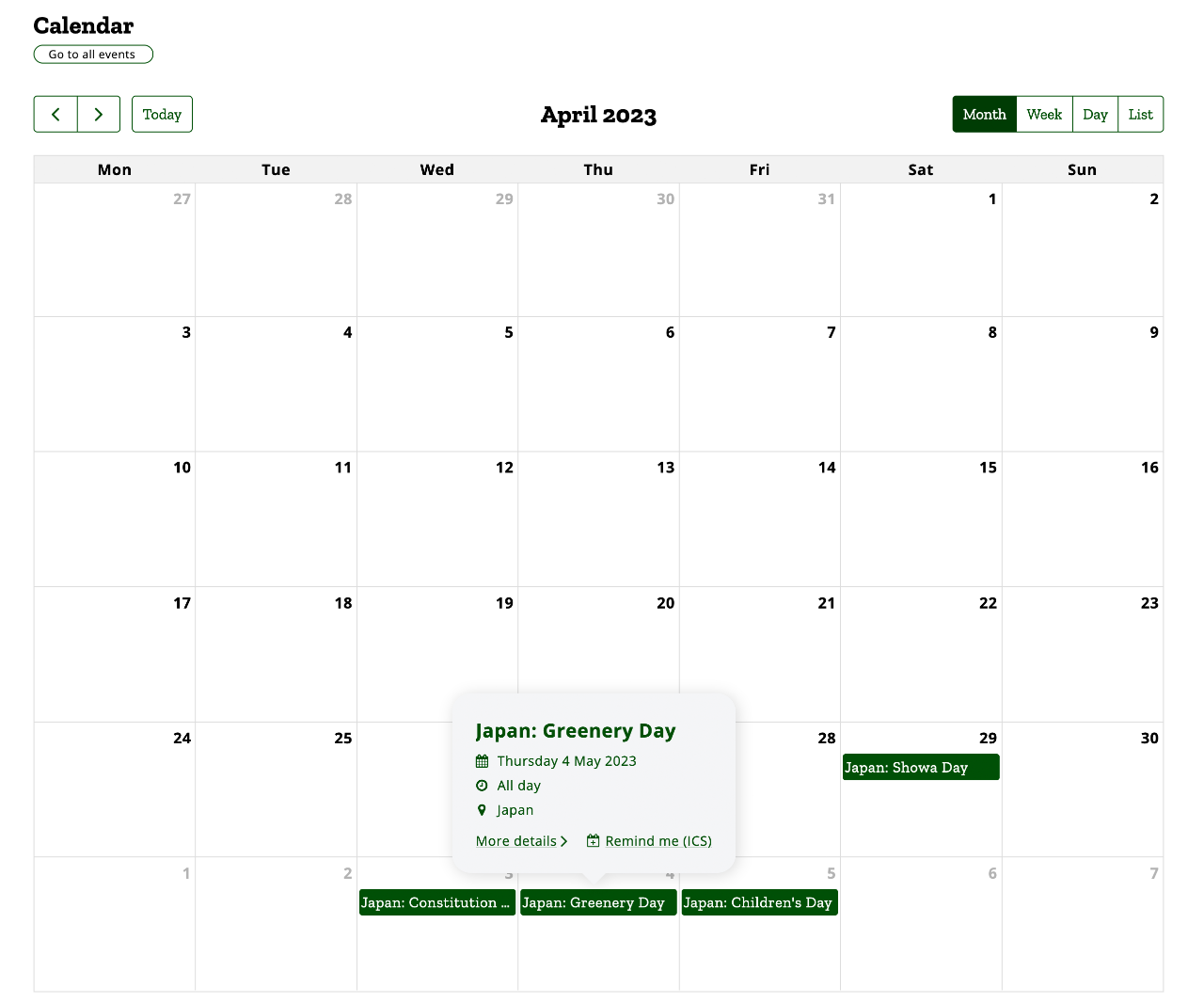
The calendar component displays your events in a traditional calender arrangement with various views depending on the page the calendar is added to and the device you are using to view the calendar.
Templates
This template is available for the following page types:
Available views
The component has two layout options:
- Month view: Events are shown in a traditional calendar month view.
- Week: Events are shown in a week format, with all the days of the week arranged in columns and events listed in the columns in order of the time of day (all day events appear at the top).
- Day: Events on the current day are shown in a column view in order of the time of day (all day events appear at the top).
- List: Events are shown in a list format in order of the date and time they are occurring.
Automatic functions
Different views are available depending on where the calendar is used or the device used to view it:
- Narrow screens or columns: Day or list view
- Normal width screens or columns: Month, week, day and list views
Before you start
Navigate to the appropriate page where you want to add the calendar component and you are ready to begin.
Please note that calendar events are not added in this component. See the guide for creating events to learn more about how to add a new event. You can also use import events to bulk import new events from an *.ICS (iCal) file.
Step 3: Configure the calendar options
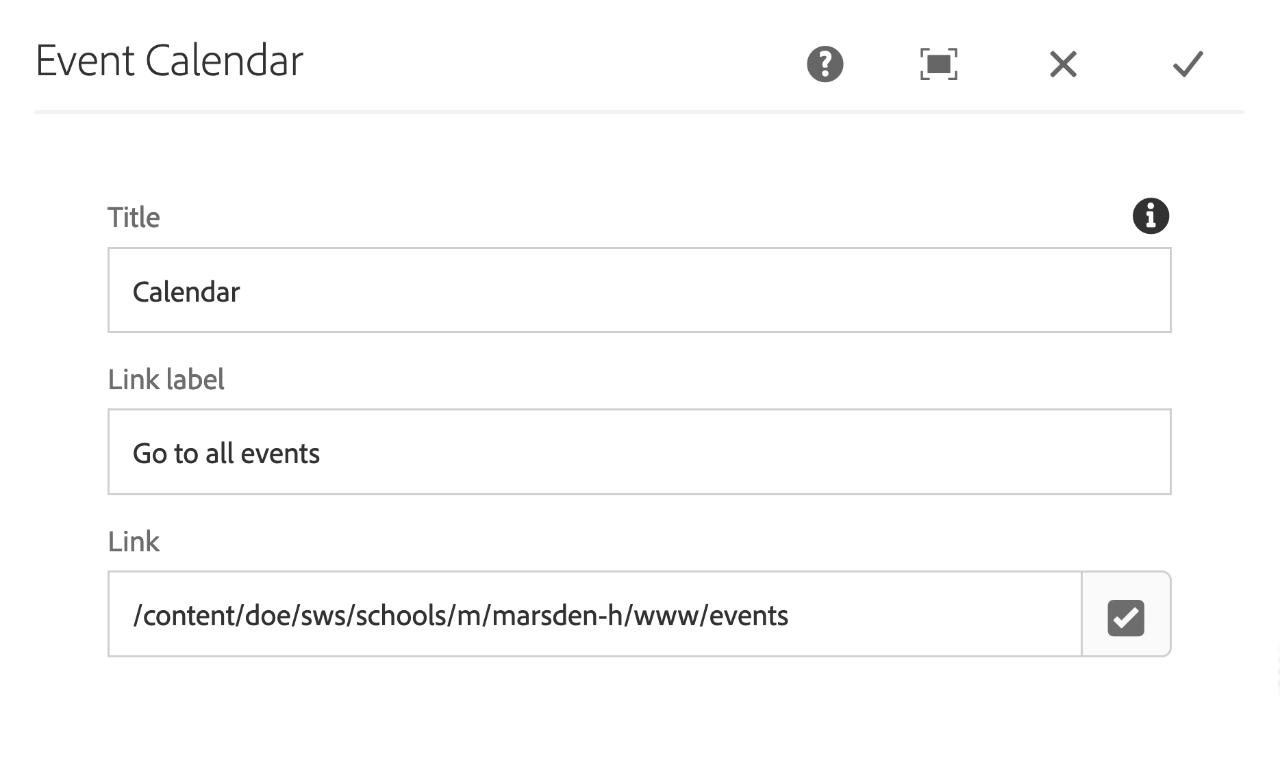
You can configure the title of the calendar component, the text for the button to see all events.
- Title: The title of the calendar
- Link label: The text used for the go to all events button
- Link: The link for the go to all events button. This should link to your default events landing page. You shouldn't need to change this.


