Use this guide to make sure you upload the best images to your website.
Adobe Experience Manager will automatically create ‘renditions’ or smaller versions of your images. However, if your original image isn’t the right size, those automatic versions might not look their best.
We’ve put together some guidelines to help you make sure you’re using the best possible image in each case on your website.
Do
Use the correct dimensions for each image type. This will stop your images from appearing stretched or distorted.
Keep your images under a recommended maximum file size of 1MB. If the file size is bigger it will take photos longer to upload. We recommend the maximum width of 1600 pixels.
Use meaningful keywords in your title.
- Save your file as a JPG or PNG.
- Read more on taking photos and images.
Dimensions and file size
The dimensions and file size requirements are different for each type of image.
Go to Edit images to know where to find dimensions in Assets.
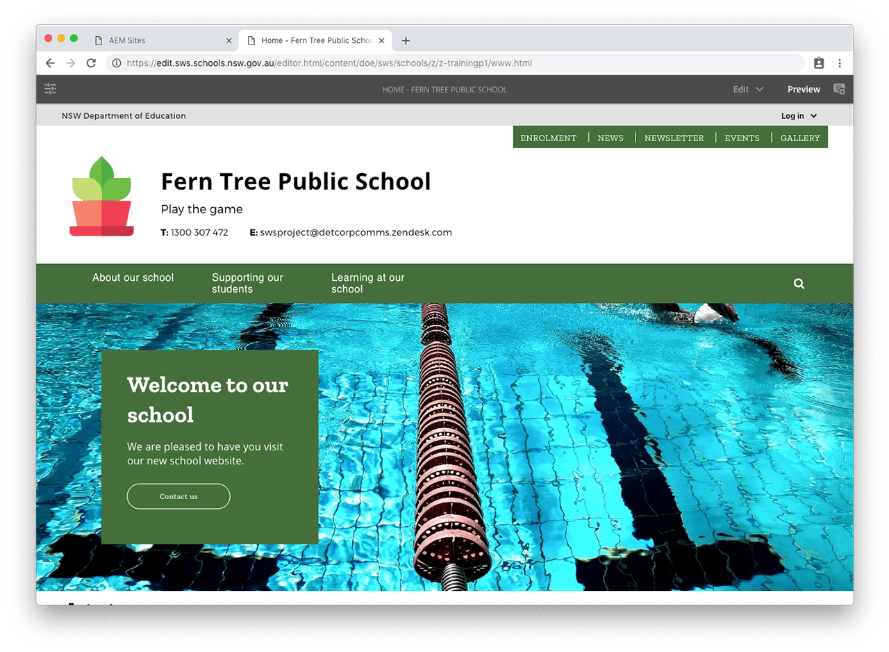
Banner – theme 1
The dimensions for banner – theme 1 are 1280x355 pixels or 33x9 cms.
The maximum file size is 200KB.
Banner – theme 2
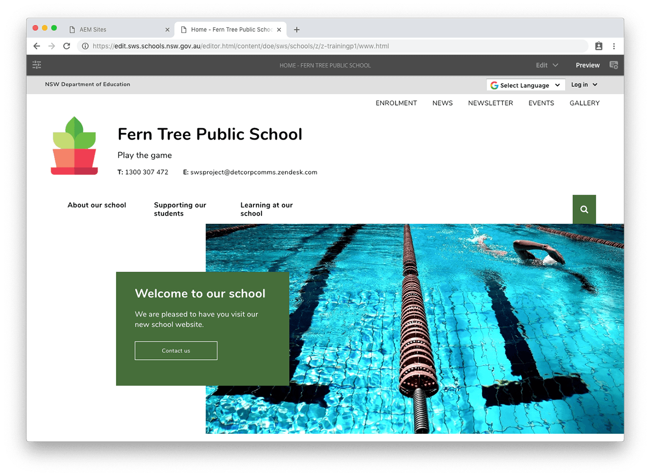
The dimensions for banner – theme 2 are 895x400 pixels or 23x10 cms.
The maximum file size is 200KB.
Banner – theme 3
The dimensions for banner – theme 3 are 1280x355 pixels or 33x9 cms.
The maximum file size is 200KB.
Banner – theme 4
The dimensions for banner – theme 4 are 1280x355 pixels or 33x9 cms.
The maximum file size is 200KB.
Banner – theme 5
The dimensions for banner – theme 5 are 950x635 pixels or 25x16 cms.
The maximum file size is 200KB.
Only use this theme with dark primary colours. If your theme 5 has black in it, switch to theme 1 or 2.
Hero banner images
For the hero banner we recommend using 3:2 aspect ratio images (landscape format). The following is a guide to sizes listed in pixels. These cover the most common image sizes:
- 3000x2000 or larger - this size is too large, the image should be resized down
- 1600x1066 - this is an appropriate size, a good balance between detail and reasonable file size
- 1280x853 - this size is marginal and will look slightly blurry
- 1000x667 or smaller - the image is too small and will look blurry on large screens
Card component
The card component takes the following image sizes:
- Normal card components accept 3:2 format images (standard landscape arrangement)
- If the 50% card component with image is inside 2 columns, it will display an image in vertical (portrait) orientation with the left and right edges cropped out.
See the card component how to guide for examples of how images are displayed.
Divider component
The divider component has various image dimensions depending on the divider layout chosen.
- Divider with image: Use a standard 3:2 landscape image with this divider layout. The image shouldn't be more than 1280 pixels in width.
- Divider with image background: Use an ultra wide image for this layout. The image should be at least 1280x460 pixels. If you use a taller image, the top and bottom will be cropped out.
- Divider with image box: Use a 21:9 wide image for this layout., at least 1280x550 pixels.
See the divider component how to guide for examples of how images are displayed.
News and event detail images
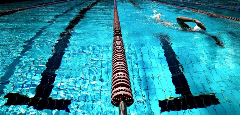
The dimensions for the news and event detail images are 770x370 pixels or 20x9 cms.
The maximum file size is 100KB.
Include alt text for news images unless the image is purely decorative. Alt text for event images will be added for you.
Image gallery album cover
Use landscape photos for your album covers as they look best.
The maximum file size is 100KB.
Include alt text for all images in your gallery.
Content images
The maximum file size for other images is 100KB.
Include alt text and a caption unless the image is purely decorative.
*Decorative, meaning:
